02
2022
Mobile App
STEEZY
STEEZY is a dance learning app that brings a full‑blown dance studio to your device—with over 1,000 to 1,500+ classes

Vinson Gotingco — Research, UX/UI
Robert Neu — VP of Design
Rodrigo Lim — Dev
Patrick Wu— PM

PROJECT INFO

A recent redesign of the onboarding flow led to a significant increase in drop off rate occurring right before account creation.

Goal

Make improvements to the onboarding flow so that users are more likely to engage with STEEZY’s content and by extension, start a trial with us.

Success Metrics

We were looking to increase account creation and start trial rate.

Challenges
research

The original hypothesis was that dark mode was a major factor in the dropoff rate. However, I felt that it was the false expectations created and order of screens that led to this.

Dark mode screens


Five main takeaways from usability testing
  1. Users expected to see actual recommendations
  2. Placement of the notification opt-in screen was off-putting
  3. Animations/videos were fun and exciting but don’t provide the user much value
  4. Preference between light mode and dark mode was almost split
  5. Users make mental notes or create calendar events to remind themselves when free trials end
Visual design
solution

We optimized the onboarding notification opt-in screen by shifting the incentive from generic updates to timely trial reminders. This reframing aimed to make the value of notifications clearer and more relevant to users.

Changes made to notification opt-in

A/B Testing

We tested two approaches: streamlining account creation by removing the “curating your class recommendations” animation, which created false expectations and led to drop-offs, and reorganizing the notification prompt to appear post-trial start to increase opt-ins.

  1. Control branch
  2. Notification permissions to be shown after a user starts a free trial
  3. Same as variant 2, but with the recommendation animation removed
Results

Using Amplitude to track the live experiment, both variants 2 and 3 outperformed the control, with Variant 3 driving a +3.3% lift in account creation and a +2.7% lift in trials started 🎉

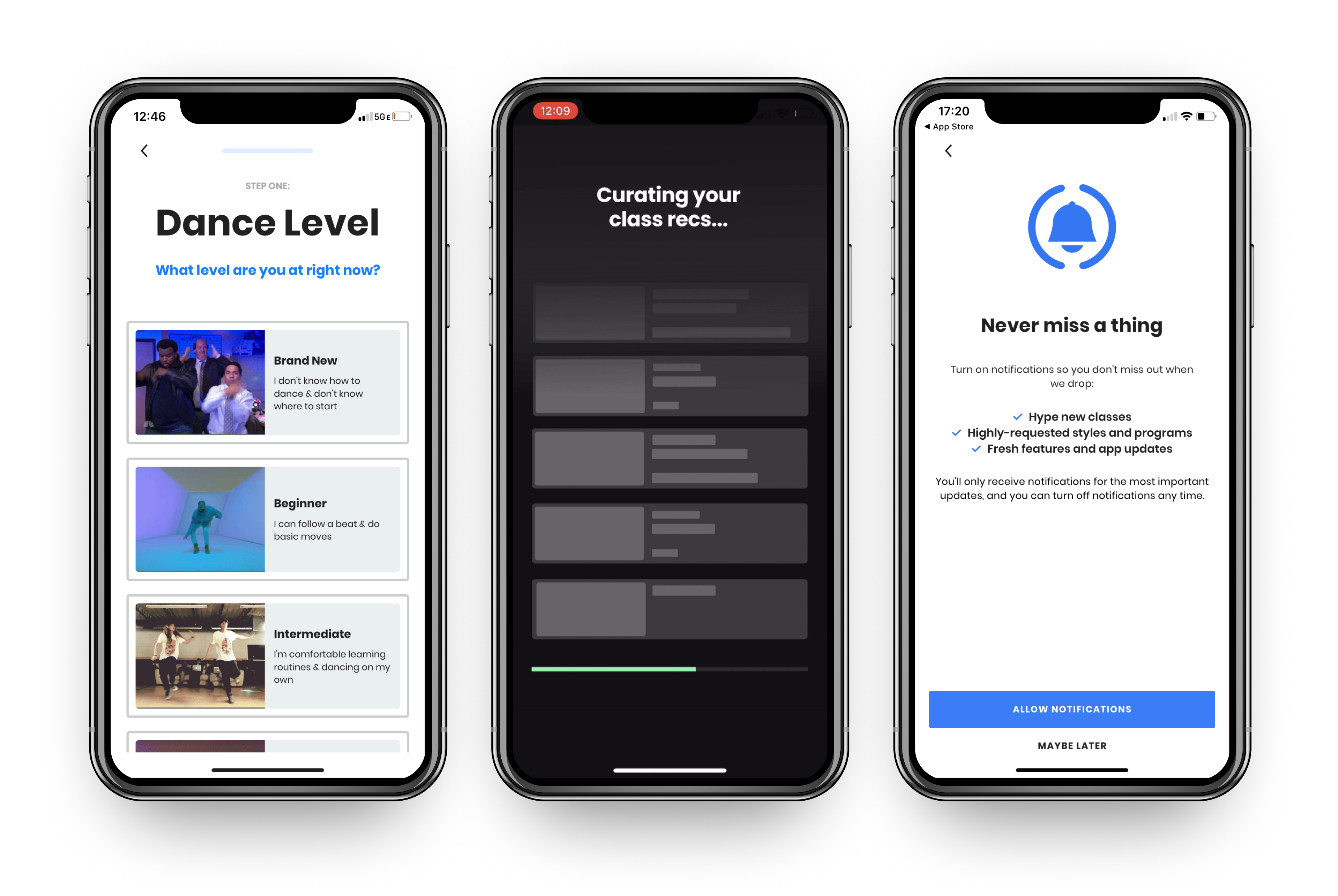
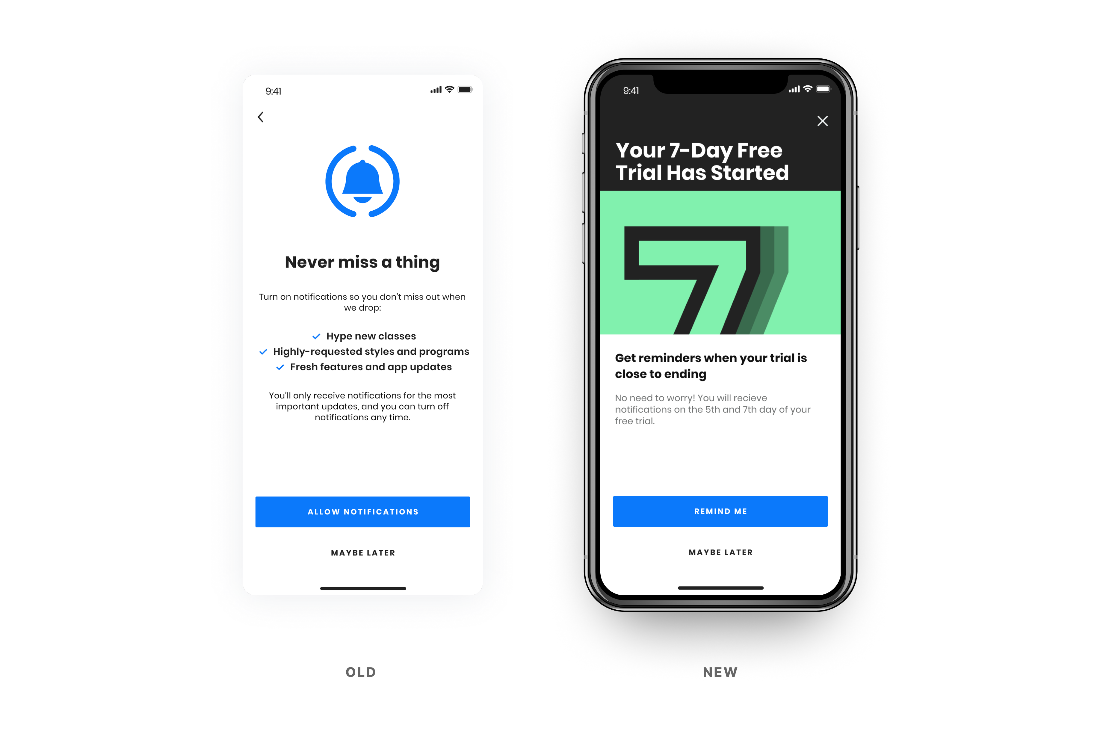
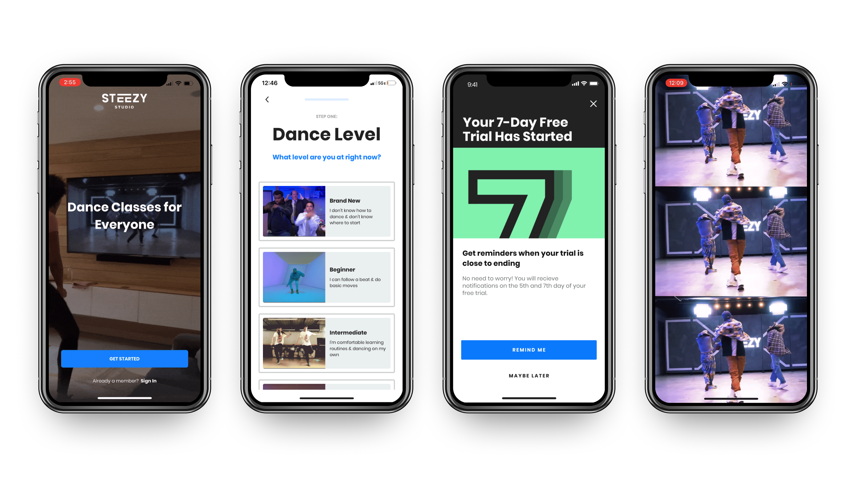
Although popular during usability research, the notification screen didn’t increase opt-in rates. However, we believe the placement changes helped drive the metrics above.

Changes implemented

Variant 3 was implemented as permanent where the recommendation animation was removed and the redesigned notification modal will only be shown after account creation.

Next steps

As account creation increased, I focused on optimizing the home page to drive more class engagement during the free trial and boost subscription conversions.

Initial home page redesign exploration
Retrospect

A/B testing shows that even small improvements are meaningful, and it’s just as important to remember the context of our testers, who may not be familiar with Figma

A/B testing continues to be a powerful way to uncover the paths that lead to growth. Even small wins matter—slight increases are still better than none, and over time they stack up to create meaningful impact. Initially, we also encountered challenges in usability testing where some participants weren’t familiar with Figma prototypes, which occasionally introduced friction in the testing process.