Vinson Gotingco — Design Lead
Caroline Sudduth — PM
Jonathan Chiu — Dev
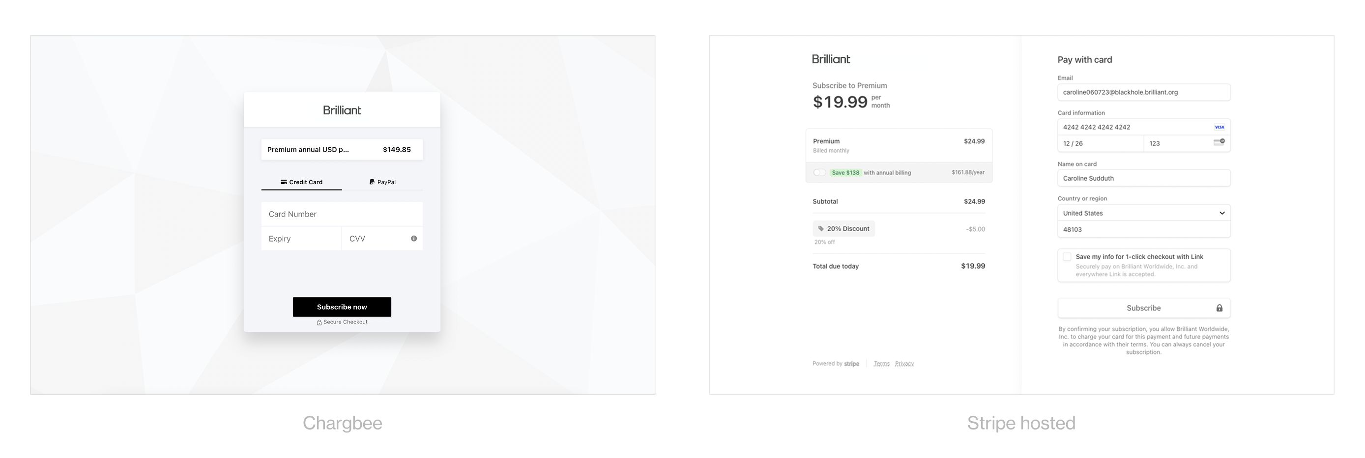
Our legacy payment processor was holding us back—both technically and in terms of business growth. From an engineering perspective, Chargebee code was messy and painful to work with. On the user side, payment options were limited, with no support for Apple Pay or Google Pay, and the system offered little flexibility to customize the checkout experience to align with our brand.
Migrating to Stripe unlocked greater technical flexibility, expanded payment options, and set us up to improve key metrics. It was the first step toward simplifying our payments system and codebase, enabling us to build new features faster in the future. While Stripe provided everything we needed, our goal wasn’t just to maintain parity—we wanted to ensure the migration drove meaningful improvements in results.
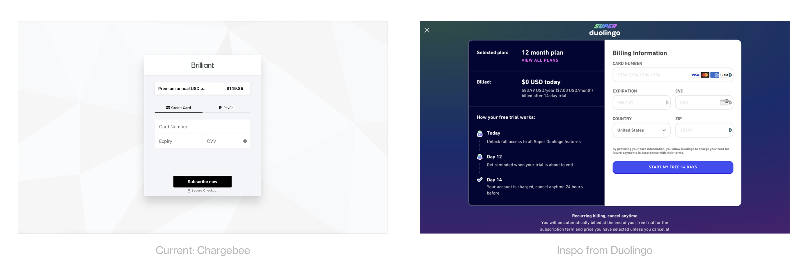
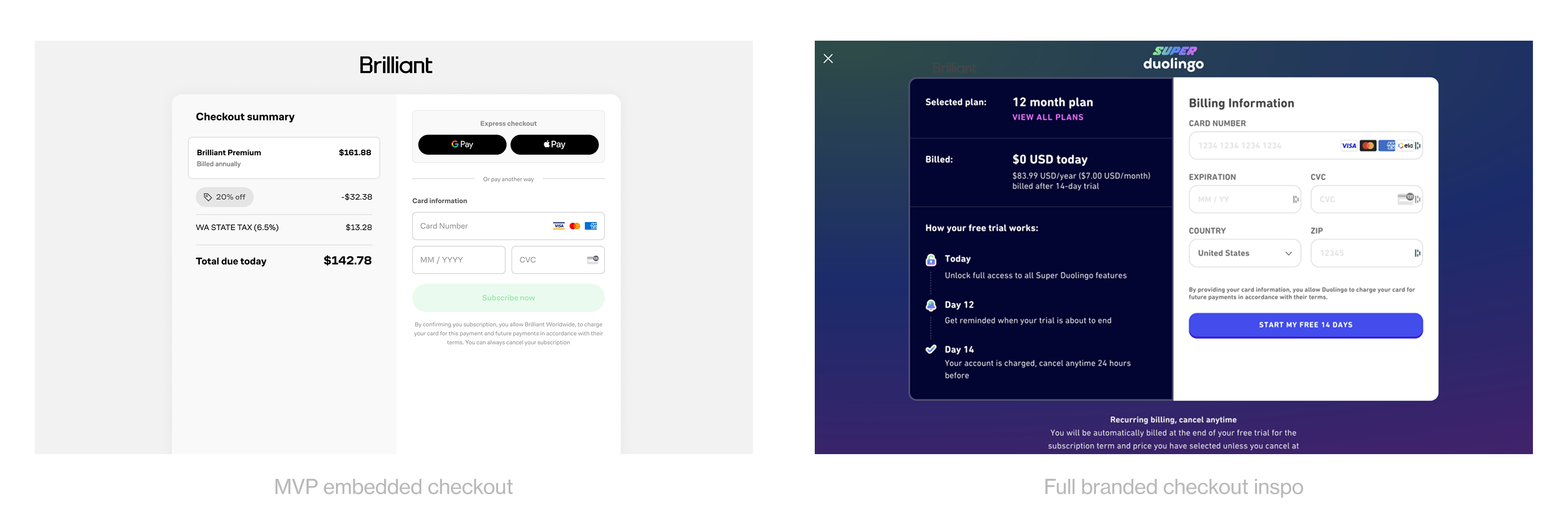
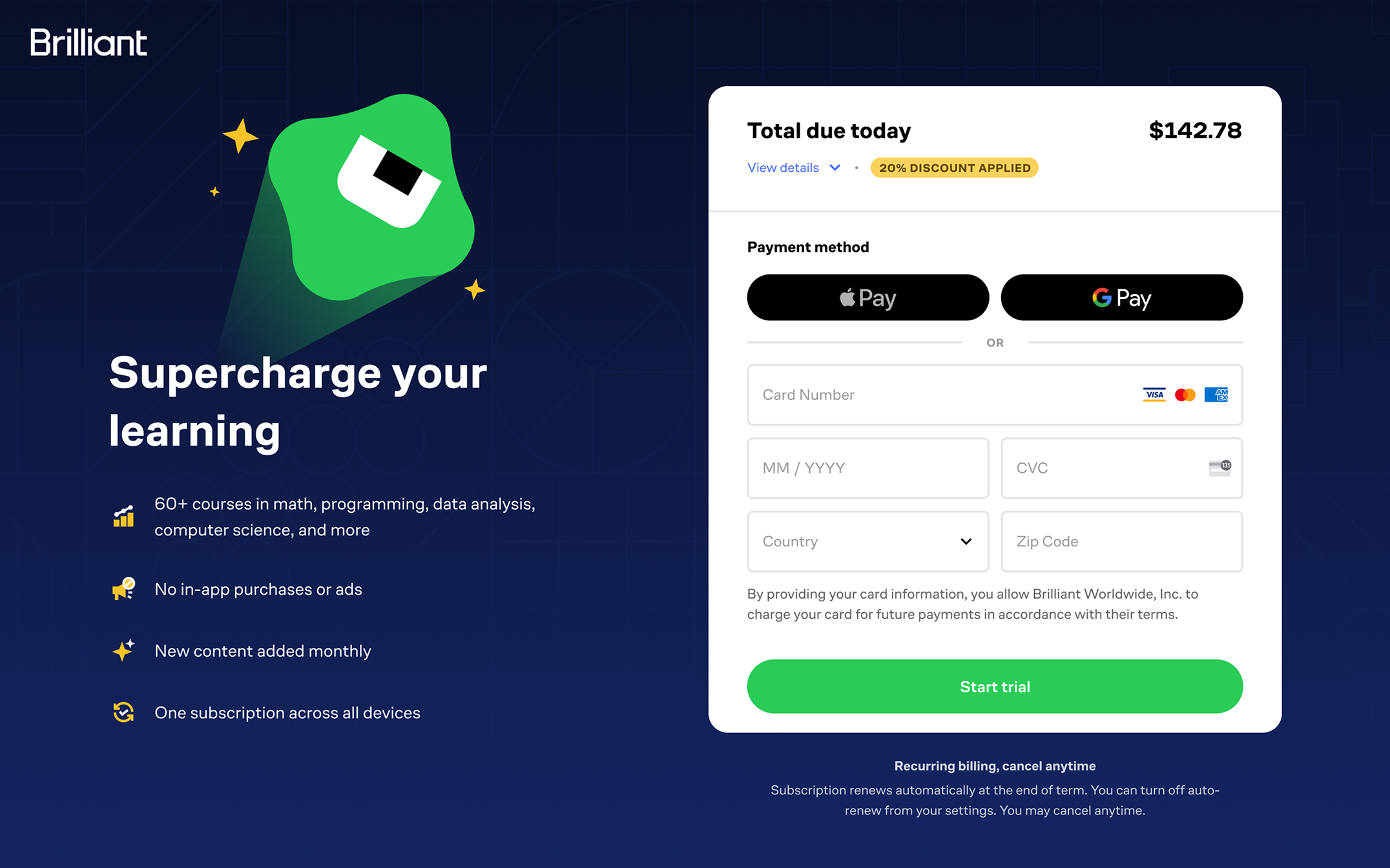
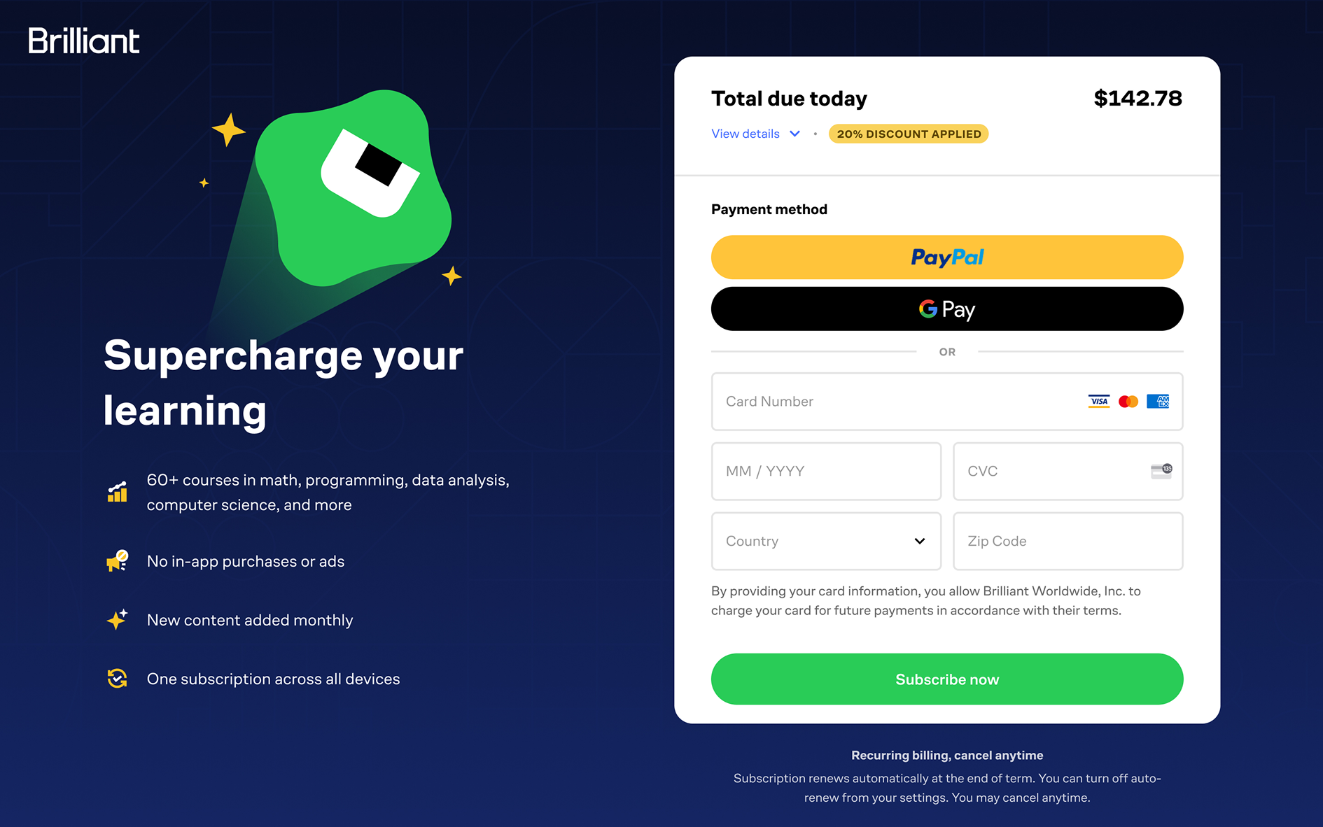
Our Chargebee checkout lacked branding, creating a disconnect from the pre-checkout experience. In exploring comps, we were inspired by Duolingo’s approach—branded checkout that used simplified pricing, clear information to put users at ease, and use of design system components. This was the direction we wanted to move toward for our own checkout experience.
When a new user signs up, they're considered a trial user. After 48 hours, they become mature users, which mainly changes the upsell messaging they see. Since trial users represent high-value leads, we focused the migration on mature users first—who already had accounts with us—to avoid jeopardizing trial conversions while still ensuring a smooth rollout.
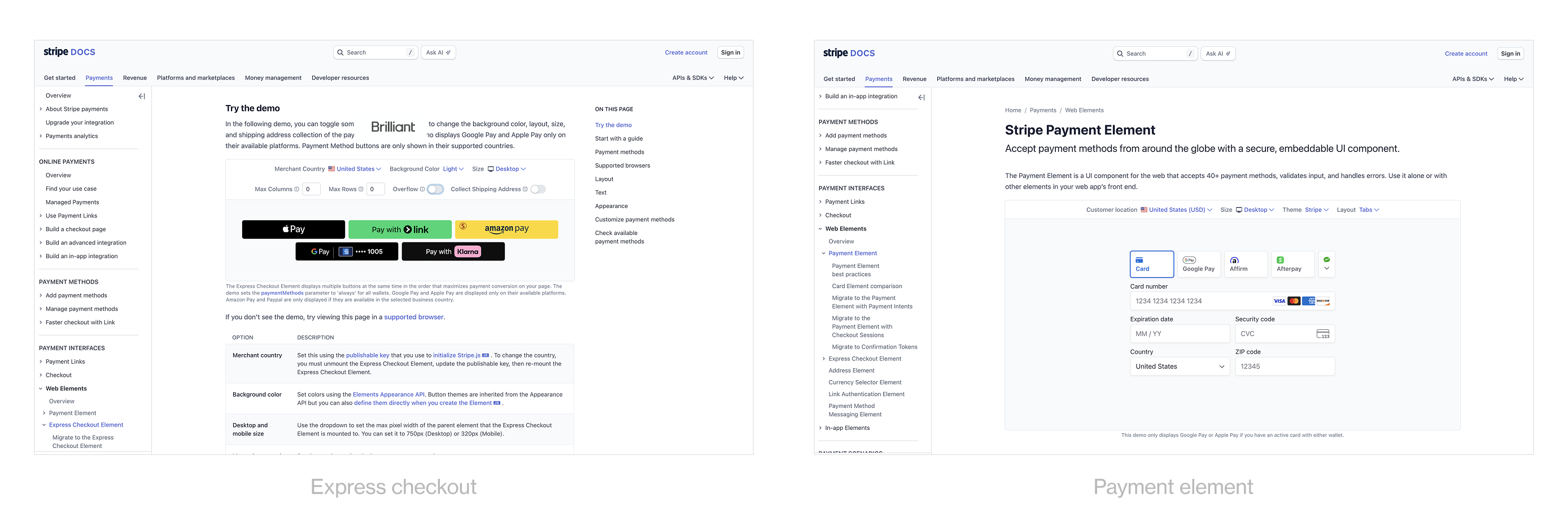
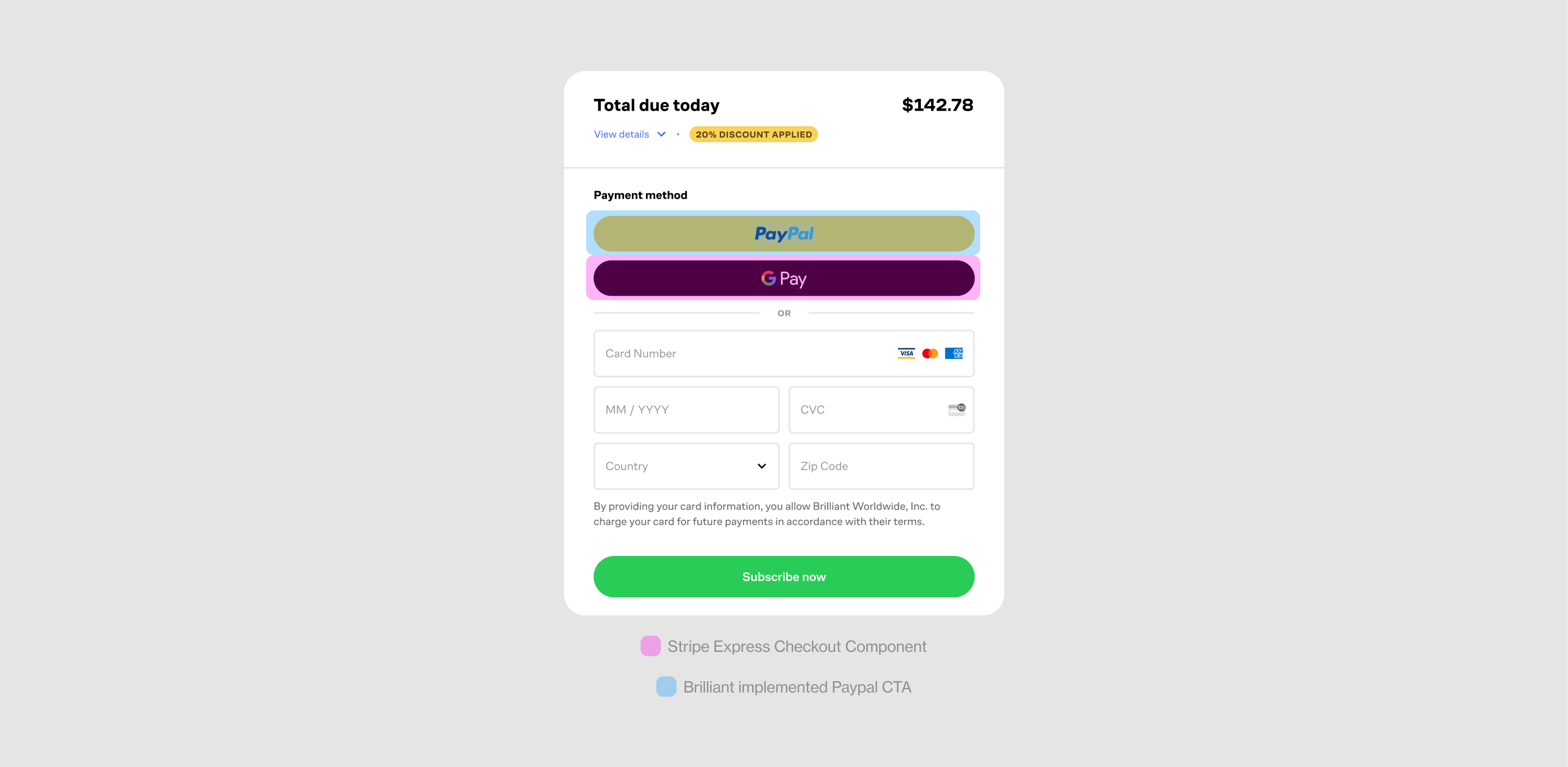
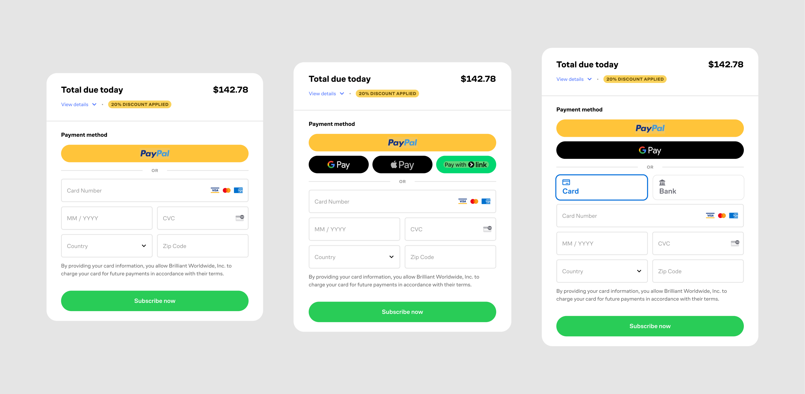
We used Stripe's standard low-code payment form as a low-effort way to test the platform and get signal on its performance.
We built a minimal custom checkout using Stripe components to test self-hosted performance and eventually enable PayPal

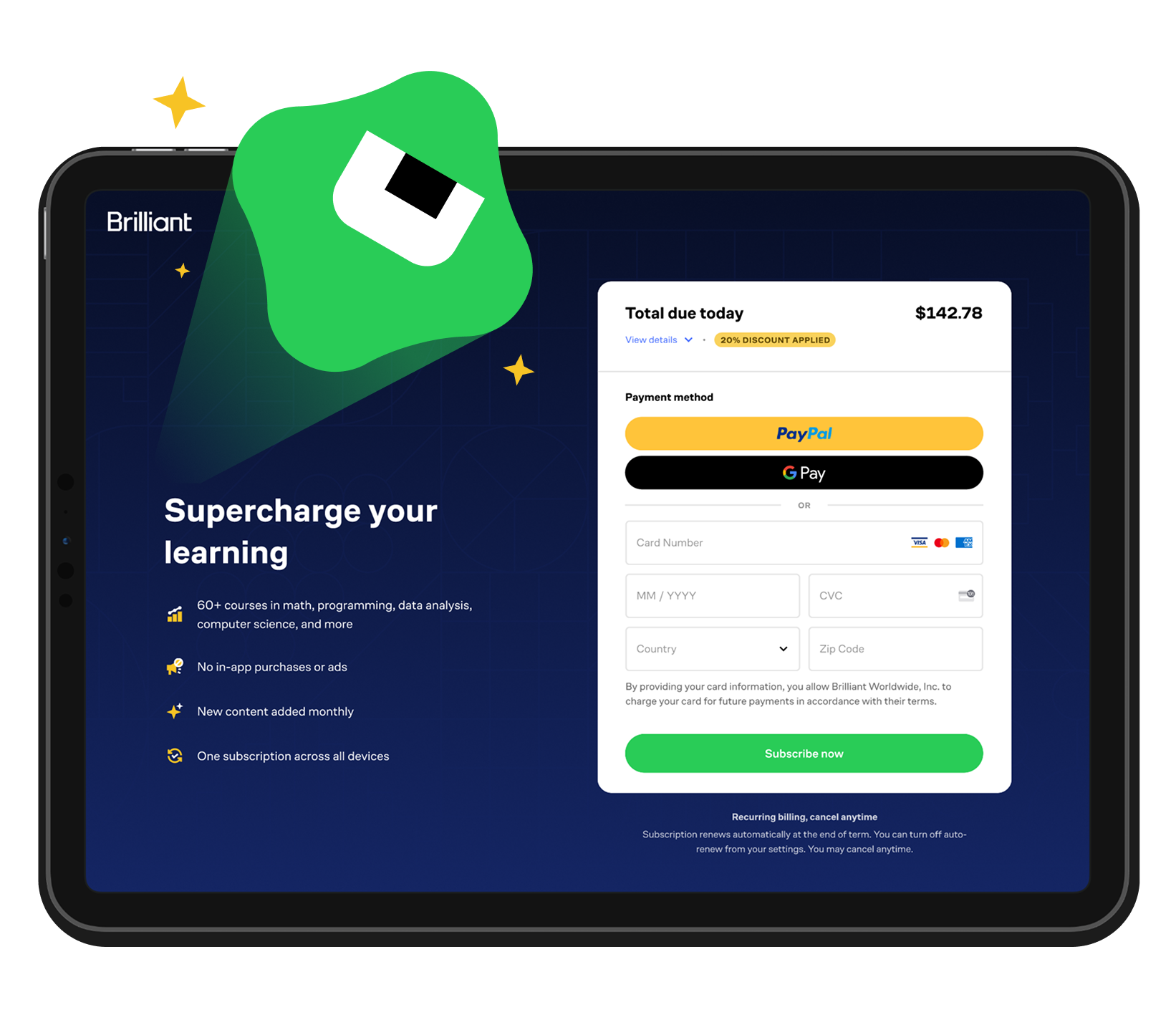
Our final phase applied extensive branding to achieve a checkout experience that felt authentically Brilliant
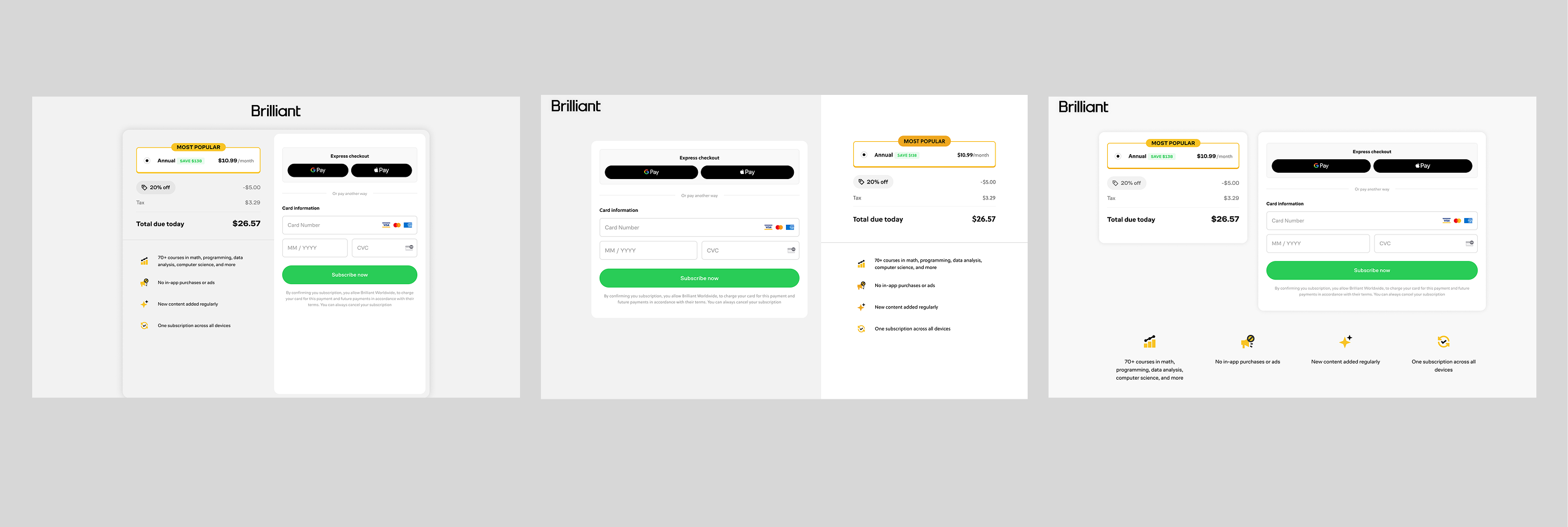
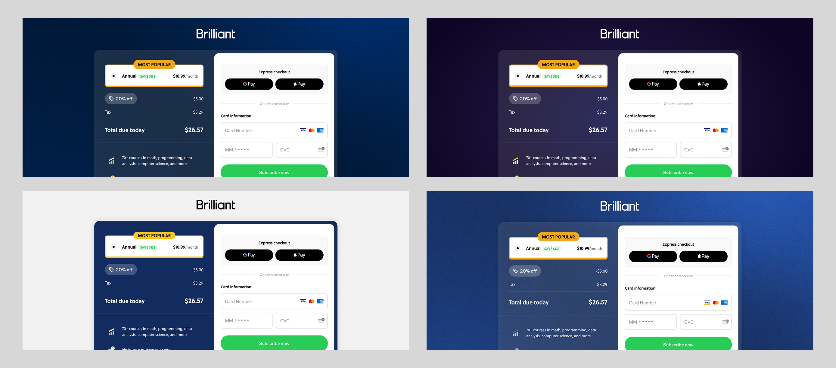
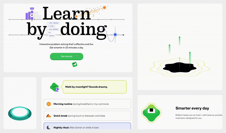
We went through many iterations of layouts and colors but struggled to land on a design that felt right. A breakthrough came when we explored incorporating our mascot, Koji—something we had initially avoided out of concern it might make checkout feel too playful at a moment when users needed to feel secure sharing payment information. Surprisingly, bringing Koji into the flow opened up new creative directions that balanced trust with personality, ultimately leading us to the design we felt most confident about.
Though overall results netted out positive, most of the gains came from desktop while mobile underperformed. On mobile, we initially shipped checkout without value props since combining them with payment details on a single page felt cluttered, and we assumed a two-step flow would hurt conversion. In a follow-up experiment, however, we tested a two-step mobile checkout flow—and it led to improved performance.

Migrating to Stripe highlighted the power of proven solutions—even Stripe’s out-of-the-box checkout drove immediate wins. To fully unlock its potential, I invested time in thoroughly reading the documentation, which clarified Stripe’s capabilities and limitations while enabling stronger collaboration with engineering.
Rather than rushing to the finish line, we took an incremental approach, breaking the migration into phases and structured experiments that reduced risk while steadily building toward our vision. And because so many experiments were running in parallel, frequent syncs with cross-functional partners became essential for keeping results in context, surfacing issues quickly, and ensuring alignment across the team.


