Vinson Gotingco - Research, UX support, creative direction, UI
Cameron Sagey - Research, creative direction
Justin Beaulieu - Branding
Scott Brassfield - Development lead
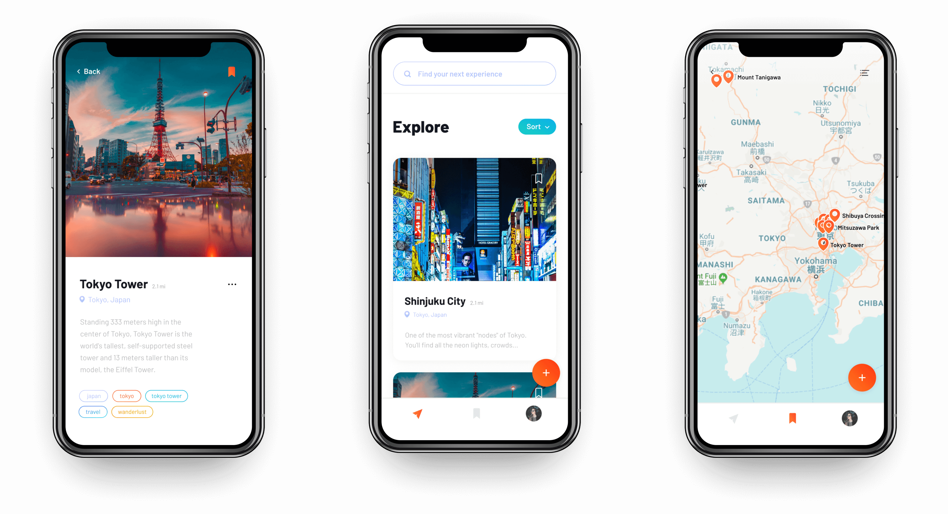
The client approached the Vincit team with wireframes and asked us to design the UI of the very first iteration of the app. Much of the UX was already provided, so we used this info to craft our creative direction. Due to short budgetary hours, we were told to "fill in the wires like a coloring book." We needed to navigate around that type of thinking and show that visual design is much more than that.
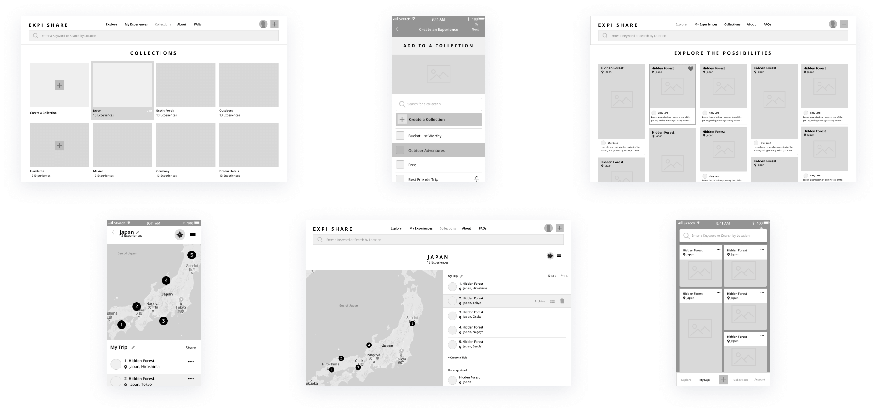
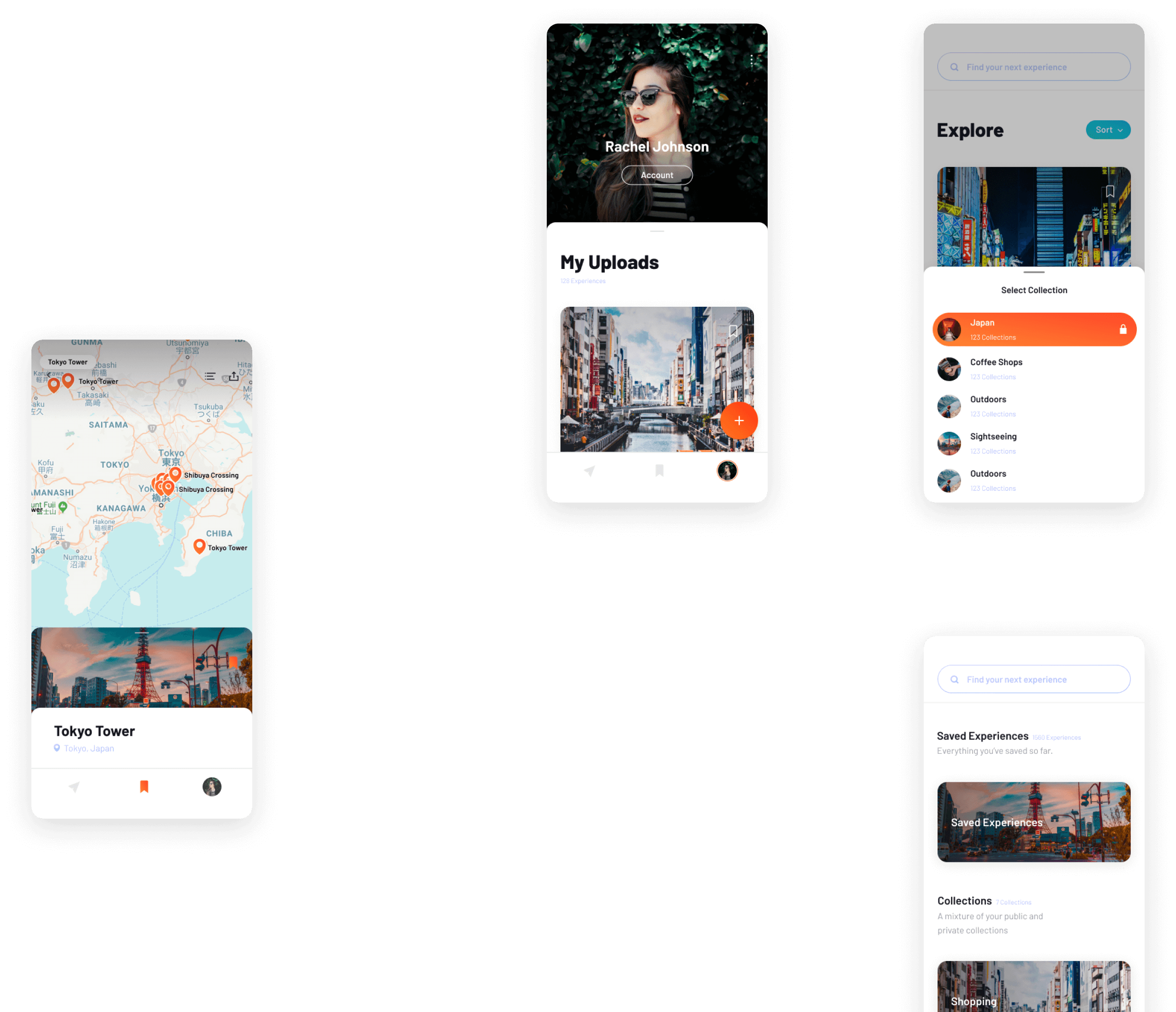
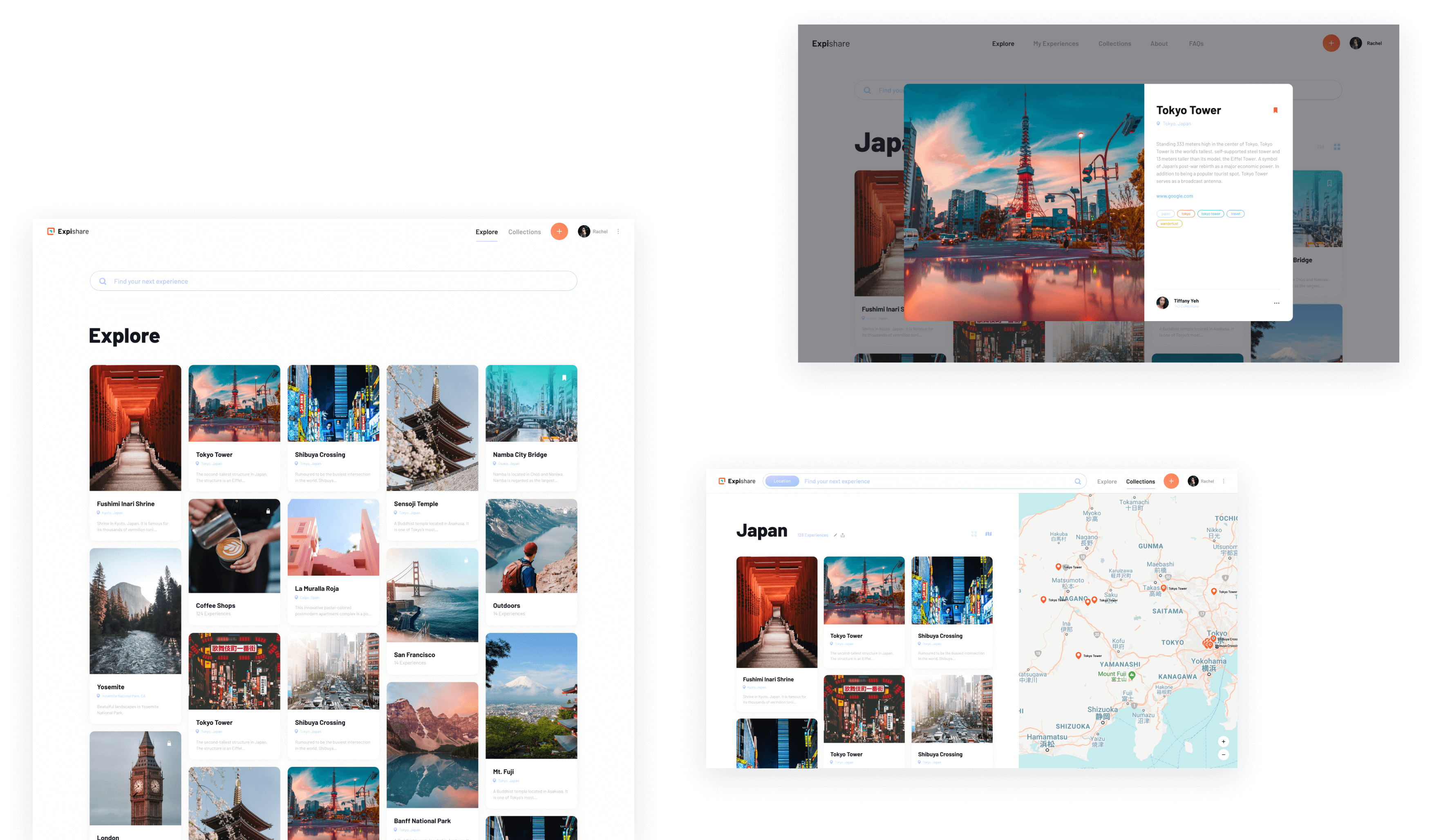
We needed to fill these UX holes. The web app needed to be responsive, but we were only given the desktop breakpoint. We made quick wires to start and refined them in the UI phase. Additionaly wires did not contain additional states such as empty, hover, and error states. Although these are small design tasks, they tend to add up and eat through the budget. To save time, we designed these in the UI phase.
According to the client, their target audience were younger millenials who travel often. To appeal to this audience, we whiteboarded for core themes that would eventually fuel the Expishare creative direction.
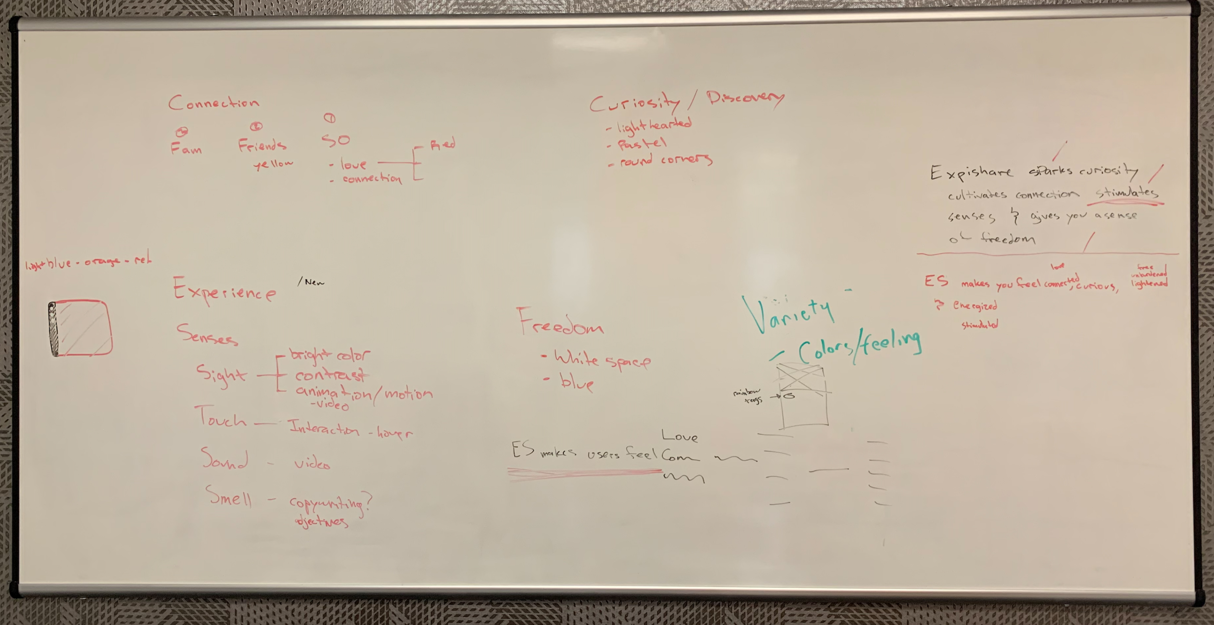
When discovering something new, people need a sense of curiosity. Connections are made between their environment, others, and/or themselves. They experience new and interesting sights, tastes, sounds, and more. Discovery provides a sense of freedom when people leave their daily responsibilites behind.
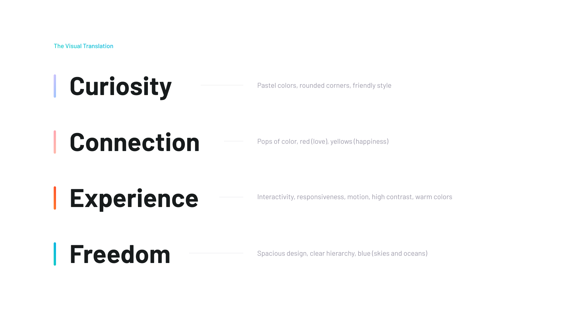

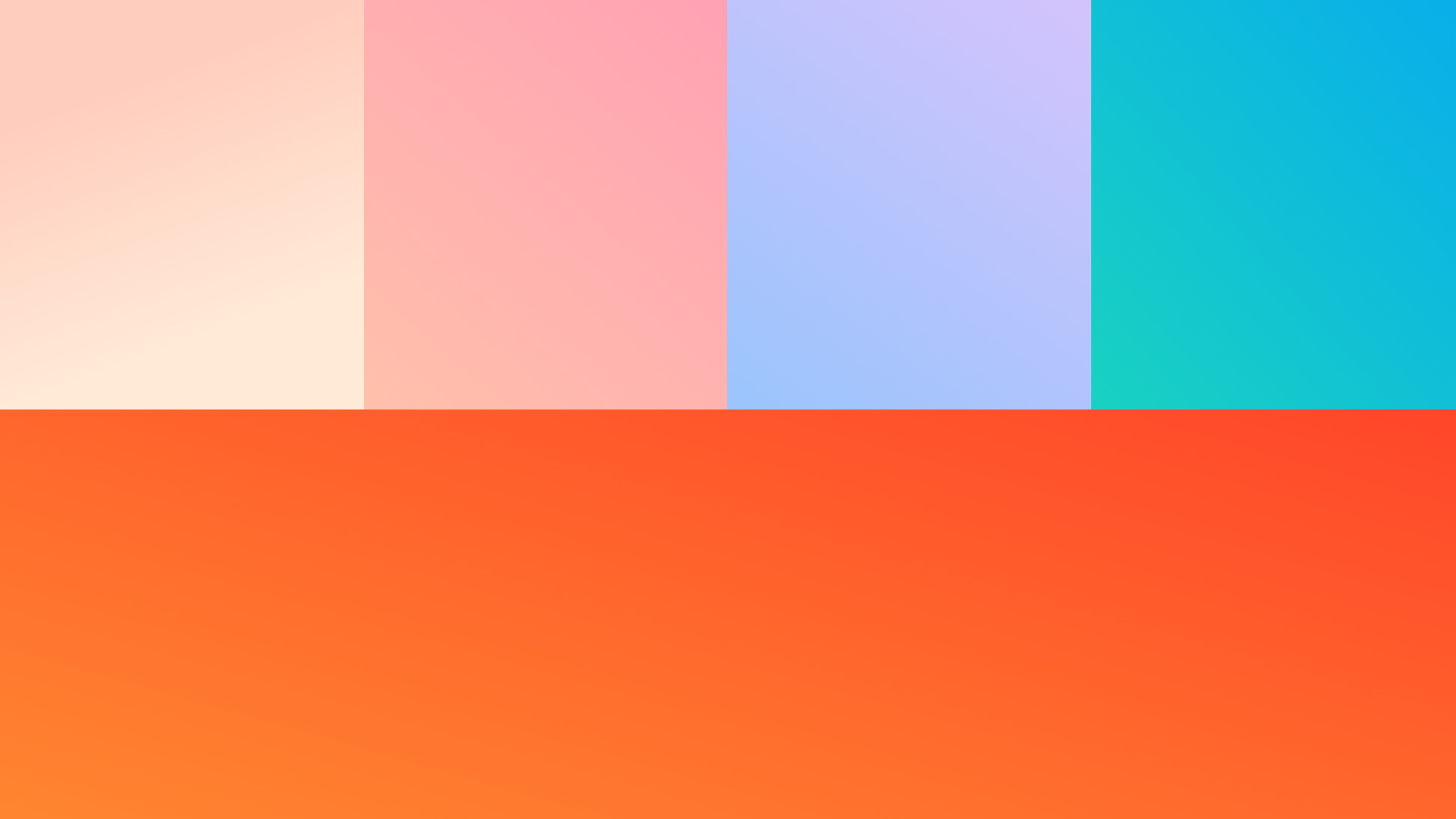
Things such as the sky or water aren’t ever solid colors but rather are gradients. Gradients are more immersive than solid colors, which goes hand in hand with the “Experience” theme. Blue gradients emulate freedom, warm gradients emulate connectedness, and pastel gradients emulate curiosity.

We won three awards: silver: interface & navigation, silver: user experience, silver: apps, games, and virtual reality.
The Expishare team is hopeful for the app’s adoption success. They have partnered with a couple of investors and are working hard to achieve this goal.
Do a better job at reviewing wireframes. From the start of the project, we noticed UX holes. However, as we got deeper into the UI phase, newer UX holes came to our attention. We could have avoided using extra hours had we reviewed the wireframes more throughly from the start.
Also, we could have better optimized our project approach. Our designs for the mobile web app and mobile app had slight differences due to browser vs device interaction capabilities. We could have done a better job of finding ways to make a single design for the two. This would have saved a lot of dev hours.
Even though wireframes were already given to us, UI design is much more than just “filling in the wires like a coloring book.” Despite the wires being already done, we still wanted to take a UX approach when crafting the creative direction.
Overall, we were satisfied that we were able to design a mobile and responsive web app with such little time. It would be great to work on this app again once it has a solid user base to give us more user insights.